Hey there, we are The Logoboy.

Strategy-led branding, packaging, digital experiences and print — designed to move ambitious brands forward.

Creative agency · Indore, India

One team for the way your brand looks, speaks and shows up.

The Logoboy helps businesses build a clear, consistent presence across identity, packaging, print and digital. We create logos and brand systems, product packaging, brochures, catalogues, marketing collateral and responsive websites.

Because design and production sit in the same workflow, ideas remain consistent from the first concept to the final website or printed piece. Our process is collaborative, practical and shaped around the audience you need to reach—not a fixed studio style.

Capabilities / 01—04

One studio.
Four ways to move a brand.

Strategy-led creative services, built as one connected system—from the first mark to the final customer touchpoint.
Selected work

Ideas built

Pinakin Premium Dry Fruit Packaging Design project
01
Packaging Design

Pinakin Premium Dry Fruit Packaging Design

View case study
Helion — Interior Design & Development Logo Design project
02
Logo Design

Helion — Interior Design & Development Logo Design

View case study
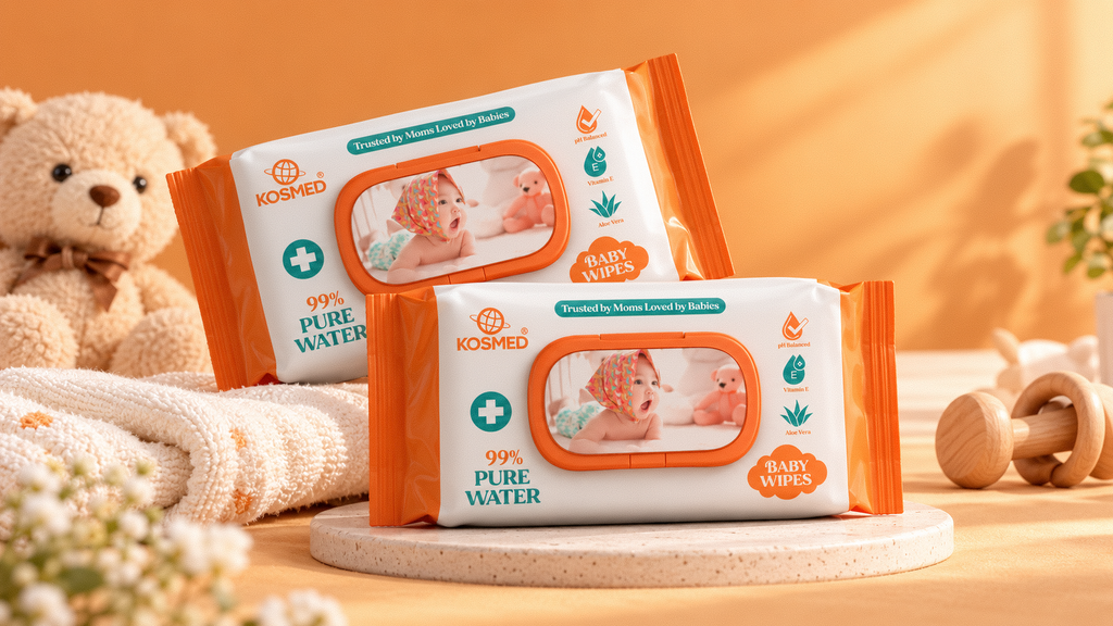
Kosmed — Baby Wipes Logo & Packaging Design project
03
Logo & Packaging Design

Kosmed — Baby Wipes Logo & Packaging Design

View case study
Arnika Group — Luxury Textile Logo Design project
05
Logo Design

Arnika Group — Luxury Textile Logo Design

View case study
Popzilla — Popcorn Branding & Packaging Design project
06
Logo & Packaging Design

Popzilla — Popcorn Branding & Packaging Design

View case study
ExploreAll
Projects

Scroll, drag, swipe or use the arrow keys to explore

Industries
We Served in

◇FMCG
✙Pharma
⌘IT
✣Cosmetic
◇Schools & Colleges
✙Hospitality
⌘Food & Spices
✣Footwear
◇Automobile
✙Real Estate
0Years
0+Clients
0+Projects Complete
0Team Size
Brand transformations

Case studies built around
problem → fix → outcome.

Clean design is only valuable when it solves the right problem. Explore how strategy-led creative work turns complexity into recognisable, useful brand systems.

Pinakin Premium Dry Fruit Packaging Design case study
01 / Case study
Problem

### Packaging a Premium Dry Fruit Experience Pinakin is a premium dry fruit brand for which we created an elegant **dry fruit packaging design** that reflects…

Fix

We created a refined packaging direction for Pinakin that reflects the premium nature of the brand while keeping the visual language clean and approachable.…

Outcome
  • The final packaging design gives Pinakin a clear and premium visual identity that aligns with the expectations of a quality dry fruit brand.
  • Through its elegant presentation, natural colour direction, and clean structure, the packaging creates a refined first impression and strengthens overall brand recognition.
  • The design is suitable for portfolio presentation, product showcases, and future packaging applications, helping establish a cohesive visual foundation for the brand.
View the full case study ↗
Helion — Interior Design & Development Logo Design case study
02 / Case study
Problem

Designing an Identity That Feels Like Home Helion is an interior design and development company focused on creating thoughtful, contemporary spaces. We…

Fix

We developed a clean, contemporary logo that reflects Helion's connection to interior design and development. Our approach centred on a minimal typographic…

Outcome
  • The completed logo gives Helion a modern and cohesive visual identity that aligns with its interior design and development positioning.
  • Its clean typography and understated composition create a professional appearance that can complement a wide range of architectural and interior design presentations.
  • The minimal design also provides flexibility across brand applications, including signage, corporate stationery, proposals, digital platforms, and project documentation.
View the full case study ↗
Kosmed — Baby Wipes Logo & Packaging Design case study
03 / Case study
Problem

Gentle Care, Thoughtfully Designed For Kosmed, a baby care brand offering aloe vera baby wipes, we created a distinctive logo and packaging design that…

Fix

We created a cohesive logo and packaging design system that reflects Kosmed's gentle, baby-friendly personality. Our design approach combined a clean brand…

Outcome
  • The completed logo and packaging design provide Kosmed with a cohesive visual identity for its baby wipes range.
  • The combination of soft colours, approachable graphics, and organised product information creates a packaging experience designed to communicate care, comfort, and clarity.
  • Consistent brand elements help make the product recognisable across packaging presentations, retail displays, and online product imagery.
View the full case study ↗
Our Clients

Brands We
Partner With

01

Testimonials

Results Our Clients Stand Behind

Trusted by clients who value consistent design, clear communication and fast delivery.

“The Logoboy gave our brand a bold new identity. Every detail felt thoughtful, modern and made to last.”

PRIYA MEHTAIndore, July 2025
01 / 04

Let’s Collaborate

FAQ / 05

Brand &
Design FAQ

Clear answers about our process, timelines and what it feels like to build a brand with us.

Still have a question?